If you’ve ever gotten a text from a friend saying “use my link and we both get a discount,” you’ve landed on a referral landing page. It’s the page a friend’s referral link sends you to, and it’s doing a lot of quiet work: explaining the deal, building trust, and getting you to sign up before you lose interest.
This guide breaks down what a referral landing page actually is, how it’s different from a regular landing page, what belongs on one, and a few real examples from well-known referral programs you can borrow ideas from.
Quick Answer
A referral landing page is a dedicated web page where someone arrives after clicking a referral link from an existing customer, friend, or affiliate. Its job is to explain the referral offer, show the reward for both sides, and convert the visitor into a signup, purchase, or lead — usually with one clear call-to-action and a short form.
How a Referral Landing Page Differs From a Regular Landing Page
A standard landing page usually sells a product or service cold, to someone who found you through an ad or search. A referral landing page has a warmer visitor — they were sent by someone they trust — so the page can skip some of the convincing and focus on confirming the deal.
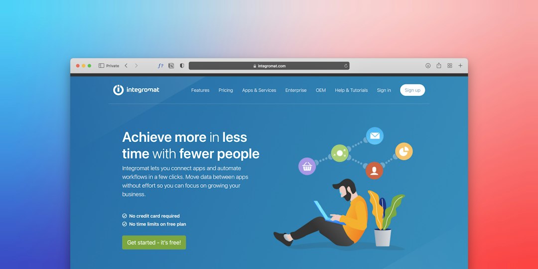
That changes what the page needs to include. Beyond the usual headline, visuals, and CTA, a referral landing page needs to clearly state the incentive (what both the referrer and the new person get), explain how the program works in a few simple steps, and link to terms and conditions so there’s no confusion about eligibility or payout timing.
It also tends to be simpler than a typical sales page — fewer competing links, no sidebar, and just one action for the visitor to take, whether that’s signing up, making a first purchase, or entering their email.
The Key Elements Every Referral Landing Page Needs
Headline and subheading that state the offer plainly — copy that answers the first question a visitor has: what’s in it for me.
A short “how it works” section, usually three steps: sign up (or share your link), your friend takes an action (buys, subscribes, joins), and the reward gets issued. Visitors who don’t understand the mechanics in a few seconds tend to leave.
A visible reward or incentive for both sides — most referral programs reward the referrer and the new person, since two-sided incentives tend to convert better than rewarding only one party.
One clear call-to-action button, repeated if the page is long, instead of multiple competing buttons that split attention.
A short signup form that asks for only what’s needed — name and email, or an account login if the program is already tied to an existing customer account.
Terms and conditions, linked (not buried), covering things like reward limits, how long a referral stays valid, and whether there’s a minimum purchase.
A short FAQ addressing the questions referral programs get most: when rewards arrive, whether they expire, and what happens if a referral doesn’t complete a purchase.
Real Referral Landing Page Examples
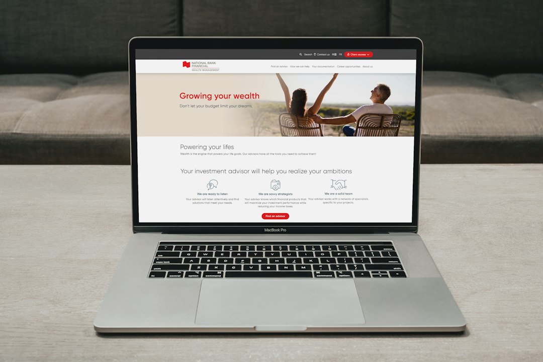
Dropbox’s referral page is the classic example of leading with the incentive instead of the ask. Instead of a headline like “invite your friends,” it frames the offer as “get more space” — Dropbox gives both the referrer and the new signup bonus storage once the friend installs the app, logs in, and verifies their email, so the whole page is built around that one simple trade.
Robinhood’s referral page opens with a direct, curiosity-driven headline along the lines of “your free stock is waiting for you.” New signups who come through a referral link don’t have to enter a code — it’s applied automatically — and the referrer sees their reward tiers laid out clearly, so both sides understand what they’re getting before they do anything else.
Airbnb’s host referral page targets a narrower audience (people who could become hosts, not just any new signup) and ties the reward to a real milestone — the new host has to complete a qualifying stay within a set window — which the page spells out instead of making a vague promise. It’s a good example of a referral page written for a specific type of referred visitor rather than a generic audience.
Harry’s prelaunch referral page, one of the most-cited examples in referral marketing, used a visible progress bar and milestone rewards instead of a flat one-time incentive — refer a few friends and unlock a small reward, refer more and the reward escalates. The page stayed deliberately simple: one headline, one value proposition, one share action, no catalog or pricing table to distract from it.
Across all four, the pattern repeats: a page that each has one job (get a share or a signup), one headline that states the deal, and a visual or step-by-step explanation of how the reward works — which is the same structure a small-business referral landing page should borrow, just scaled down.
Tips / Common Mistakes
Don’t make visitors hunt for the offer. If someone has to scroll past a hero image and two paragraphs before learning what they get, the page is working against itself — lead with the incentive.
Don’t ask for more information than necessary. A referral signup form with eight fields will lose people who were ready to convert on field two.
Don’t skip the FAQ. Referral programs generate a predictable set of questions (reward timing, expiration, fraud rules), and answering them on the page means fewer support emails and fewer abandoned signups.
Don’t add navigation that leads away from the page. Referral landing pages typically perform better stripped of the main site’s header/footer links, since every extra exit reduces the chance of a completed signup.
Don’t forget mobile. A large share of referral traffic arrives through text messages and social shares, so test the page on a phone screen, not just a desktop monitor.
Explore more: Referral Basics hub.
Referral landing page FAQs
Is a referral landing page the same as a referral program?
No. The referral program is the overall system — the rules, rewards, and tracking. The referral landing page is just the specific web page a referred visitor lands on to learn about the offer and sign up.
Who typically sees a referral landing page?
Two groups: existing customers who go there to grab their personal referral link to share, and new visitors who click a friend’s referral link and land there to learn about the offer.
Do I need a separate landing page for referrals, or can I reuse my homepage?
A dedicated page almost always performs better. It lets you speak directly to a referred visitor, explain the specific offer and reward, and remove distractions that a general homepage can’t avoid.
What’s the single most important element on a referral landing page?
A clear, specific incentive stated right in the headline or subheading. If a visitor can’t tell what they get within a few seconds, most other design choices won’t matter.
Turn Customers Into Your Growth Engine
Launch a referral program that turns happy customers into your best growth channel — with ReferralEarl. Try ReferralEarl.
Want this in your inbox? Subscribe to the free newsletter.
Photo: Besser, Jerome F / Public domain, via Wikimedia Commons.